

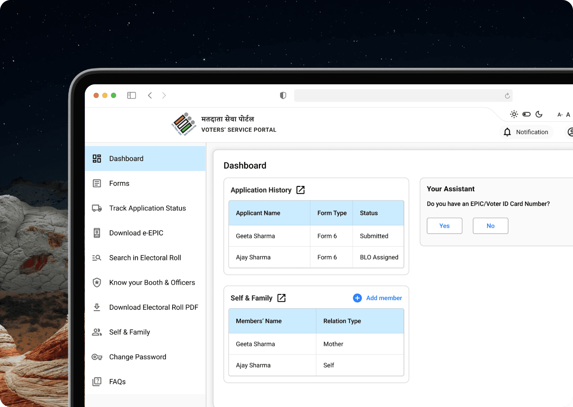
What this app is about?
BLO App (erstwhile known as GARUDA App) is a dedicated mobile app that allows BLOs to perform their tasks digitally.
Following are the main features of the BLO App:
Checklist/Field Verification of Forms
Collection of AMF (Assured Minimum Facility)/EMF (Extended Minimum Facility)
Capturing of GIS coordinates of Polling Stations.
Update of Photos of Polling Stations
Form Submission on behalf of Electors
House to House Verification
My Role
Responsible for the overall app design.
Constraints
The design process relied on secondary information sources.
Clear expectations from the client regarding the design were not provided.
Feedback primarily focused on areas that needed improvement, with limited insights on what was working well.
Feedback was relayed indirectly through the developer's Head, rather than directly from the client or end users.
The design team did not have direct interactions with the client or users.
The design team was not involved in client meetings or other direct communications.
Information source

Analysing the existing design

Our users
Officer at Election Commission of India, who wanted to have an ease to access for the information irrespective of where they are. Having control over who their Subordinates and their team are doing. The idea was that laptop and tablet are often not easy to carry in comparison to mobile. A quick and easy way to view the required information was an app as per the client.
Defining
After analysing the Garuda App, I realised the app should be,
Ease with interactions.
Single color to reduce distractions.
Behaviour of the app to be like those of what users use such Google apps and Facebook.
Easy to develop for quick development.
Easy future development because of the used resources.
Build the app ensuring consistency across all elements and screens so that it can support the future addition and subtraction of elements.
Officers’ actions are more of responsible tasks.
Designing

Iterations
Enhancing the Facilities
I Considered the ease here that, if any facility is available the user can turn On the toggle and if it’s available the user can turn it On or keep it Off. But I forgot there are options at the bottom which ask Yes and No, for which this might not be suitable. Also, the toggle option wasn’t something that can reflect tasks of responsibility for marking the status. Here responsibility lies on marking facilities Available and Not Available. If mistakenly marked wrong, it will be a problem. I’m thankful to client for asking to change from toggle to Available/Not Available button. In which further functionalities was also added such as giving rating and adding a comment.

Enhancing the Checklist
The previous version was created keeping in mind the long list of forms the officers has to view. In order to give them control over to view form from any specific type or from any date or if they want to see forms filled by them or not. Team has a different view over this and asked to give a search option instead, the same was shared with the client and further developed.

Email address
LinkedIn profile URL
© 2026 | Designed and Developed by Mohit Chaurasia