

What this website is about?
The Voters’ Services Portal (VSP) is an online service made available by the Election Commission of India to facilitate the citizen of India the below activities.
Apply online for registration of new voter/due to shifting from AC
Apply online for registration of overseas voter
Deletion or objection in electoral roll
Correction of entries in electoral roll
Transposition within Assembly
Track application status
Know your Booth, AC and PC.
Know your BLO, ERO and DEO.
My Role
Responsible for the overall app design.
Constraints
Information sources to design the product were secondary.
No information about the design expectation of client.
User feedback wasn’t shared nor user interactions happened.
Design team wasn’t the part of any client call or other interactions.
Design team wasn’t considered a contributor to the project.
Information source

Analysing the existing design

Our users
When it comes to registering as a new voter, making some corrections to the voter ID card etc. These facilities are made available to the general resident of India. So the users for the our designed website is anyone who want to avail any of the service which the website list.
Defining
After analysing the existing website, I realised that the website should,
Match the level at which ECI operates, so that it can communicate the seriousness of their work and reflect professionalism.
Have an easy interface to be accepted by the users, this allows them to use the product without fear.
Consistency across the website for a smoother experience.
Designing
Iterations
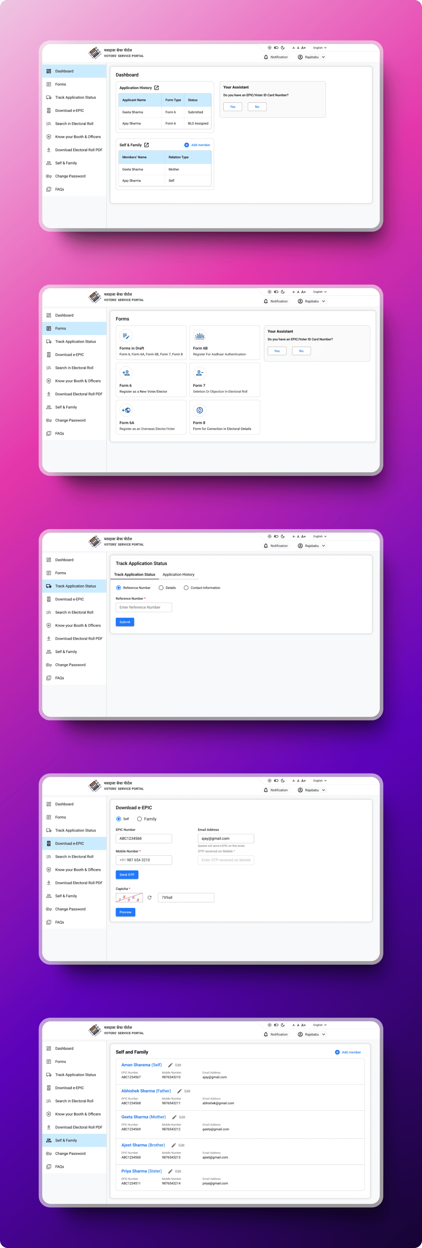
A Better Form
Whenever a digital product is created wherein a user will be spending in a good amount of time and conscious brain in comparison to a digital product where user isn’t providing the inputs, it’s best to guide the user upfront on what all will be coming. When it comes to filling a form on a government website user it more conscious than filling a form on a eCommerce website. On government websites there are less chances of errors to be entertained, so ensuring the user is at mental peace we need to guide the user with appropriate form layout, right error message, less eye travel, easy readability etc.
Considering the above mentioned things I created the second version of the form which is currently live. The previous version was created in very much of hustle that end up being created like that of what the NVSP website was having. On that time all team members were adapting to the client, most of the things were unbalanced for some initial days.
Very few inputs I got one of which is the blue gradient in the initial design from the Head of Development Team and it was an order. Which later changed to a light blue as white text was not visible on the gradient as we move toward the end of it.
Light blue heading background was doing two things making the website visuals light and long texts were no problem with readability and also that saved developers’ time on adding two colors.

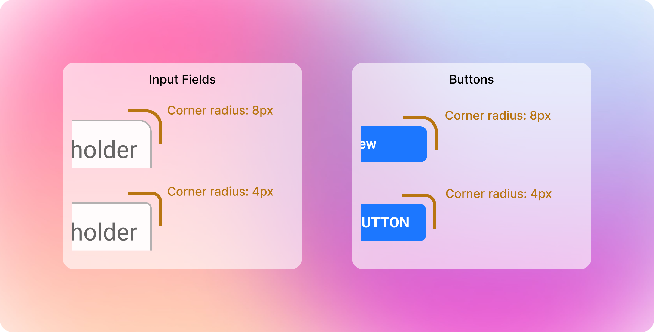
Going for matching the standard
Giving 8px corner radius was giving a friendly tone,
whereas giving 4px corner radius made it a perfect choice as 0px corner radius offers a hard tone or a tone of high order which isn’t ECI. So going for 4px corner radius was the ideal choice which is neither friendly nor so hard, just perfectly Moderate. Which matches with the ECI’s reputation and perception people have about it.

Email address
LinkedIn profile URL
© 2026 | Designed and Developed by Mohit Chaurasia